
I've been looking at various works from a multitude of media. I think I've been trying to saturate my brain with art and ideas in order to inspire some sort of inner dialogue. I should really be recording my ideas as I come up with them, which is why I can't wait to get into Dolphin to cut down paper for my somewhat-transparent sketchbook. Stupid snow. ::shakes fist::
...Wait, a place to record my thoughts. Isn't that what this blog is for? Without further ado (in no specific older):

I found this via Luke Williams' blog. Luke is a MICA alum with an eye for type, and a designer whose work I really enjoy. The Compendium is pretty exhaustive, and I haven't had the time to look through it all yet. I'm pretty sure that's why I'm so excited to have stumbled across it. This page, however, is gorgeous. (Luke posted this one, too). Not sure if it's relevant to my thesis work specifically, but everything is pretty relevant right now.
Jeff Canham's Sign Painting (and Art & Design)

This particular print is called "The Coast is Clear". I have really been enjoying Canham's lettering and his drawing style. This particular print resonates with me for its simple layering and use of transparency. There's not much of it, but I like the way it's done (especially the tight registration on the rays of the sun!)
Andrew Bannecker's Gorgeous Illustrations
Andrew Bannecker's work is gorgeous. His use of color, texture, and the illusion of overlaps & transparency is really inspiring for me right now. Bannecker's work has a sense of whimsy to it without employing unrecognizable imagery. Bannecker takes the banal and re-contextualizes it to create moments in an impossibly beautiful world. That might have been a little flowery. Reader's Digest™ condensed version: I've been obsessed with his work for a little while now, especially with this particular piece, which is called "No Turning Back". As my obvious fangirlishness relates to my thesis, I would like to incorporate ethereal textures into my work, and have started to do a little research on paper made from Abaca to begin to achieve that effect.
Mikey Burton's Thesis Work (and the rest of his work, too)

Mikey Burton re-branded a bunch of books we all had to read in Middle School and in High School. If they looked like this at the time, I would likely have been more excited to read them. I enjoyed reading a lot (and I still do!), but dissecting literature was never a passion of mine. Burton's work, like Bannecker's, employs gorgeous textures (though the textures are very different). Burton uses a lot of letterpress in his work, a medium (process?) of which I've been a long-time fan. Mikey Burton's thesis project is a good source or inspiration for me because he successfully re-invented books. I'd like to re-invent the experience of the book. In a way. (This is obvious from the title of my thesis project.)
Studio on Fire's Letterpress work and Design

Studio on Fire is an awesome Letterpress shop & Design firm in Minneapolis, MN. They create beautiful work, and I love looking at their client jobs and reading about the specific hurdles of each project on their blog, Beast Pieces, but their design work is stunning as well, especially when they experiment as they did with this piece for the College of Visual Arts in St. Paul, MN. Letterpress is a great way to work with transparency. I wonder if I can effectively letterpress on clear paper?
Jessica Hische's Amazing Lettering and Amazing Everything Else, Too.
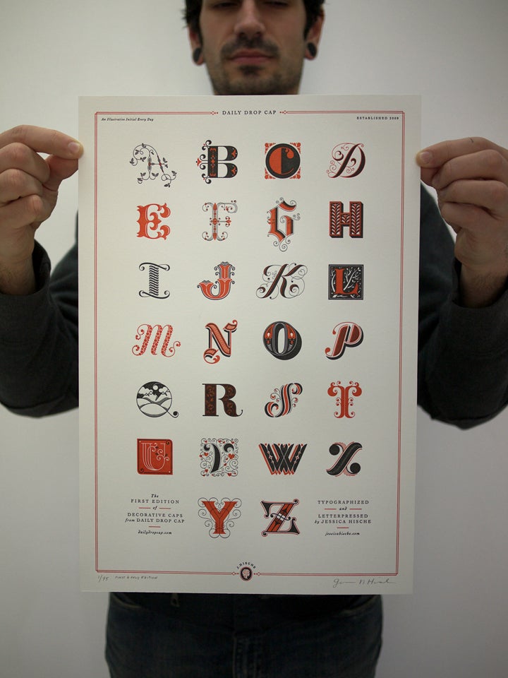
HolyCrapILoveJessicaHische. That said, I really do admire her work. I think her particular brand of Ilustrator-drawn-illustrations is unique and either hilarious, adorable, or classy depending on the project. She does beautiful lettering and design, and her book cover and layout work (much of which was designed while she worked for Louise Fili) is just as well-considered; it is perfectly designed to every last detail. How does this relate to my thesis? It...uh...it's pretty! In all seriousness, I'm looking at drawing letters as the content for one of my books, and Jessica's work will certainly be open in my web browser for the entirety of that process. Maybe I should use her Drop Caps for my blog. Maybe that would be overkill.
Erasing.tumblr
Erasing is a tumblr art crawl curated by Scott David Herman of Erasing.org. I didn't actually know this until just now, trying to figure out how to write this paragraph. Honstly, I have yet to look at Mr. Herman's work, but I love the theme of his tumblr: everything is mostly white art. The simple palette lends itself rather nicely to my project, as I'll likely be working with a limited palette as well. Looking at this
Evelin Kasikov's Printed Matter


In stark contrast to the Erasing collection's "all white all the time" aesthetic, I've been obsessing over the work of Evelin Kasikov—specifically her "Printed Matter". Ms. Kasikov has been stretching the bounds of printing by embroidering CMYK halftone patterns by hand. She has a set of four books full of research, experiments, and exploration of creating type and image using embroidery in a new way. I especially love when she combines computer generates graphics with her embroidery; she creates a new sense of dimensionality and tactility that really sets her work apart.
--
Whew! This blog entry took me forever, but this time, when my laptop runs out of batteries, I'll have all of my links in one convenient place. Please, if any of these interest you, browse through the websites. There's some amazing work to be seen here.
Note: This thing was obscenely difficult to format for some reason. Does anyone else have a work-around for this?
Note2:
No comments:
Post a Comment